UX Case study
Redesigning ad setup in OptimizeApp to empower smarter budget decisions

overview
Finiding the Problem
Poor ad performance leads to an increased drop-off rate.
Users often struggled with selecting the right ad budget and understanding its relationship with campaign duration, leading to poor outcomes and increased reliance on support.
Collecting data:
- Support team collects and categorizes campaign-related queries weekly and send them to the stakegolders.
- Patterns and issues are then summarized by the design team.
Common issues:
- Users don’t understand how much budget is enough to get results.
- Users don’t know how duration affects performance.
- Some users abandon our platform immediately after seeing poor results, even from their first ad.
Design issues:
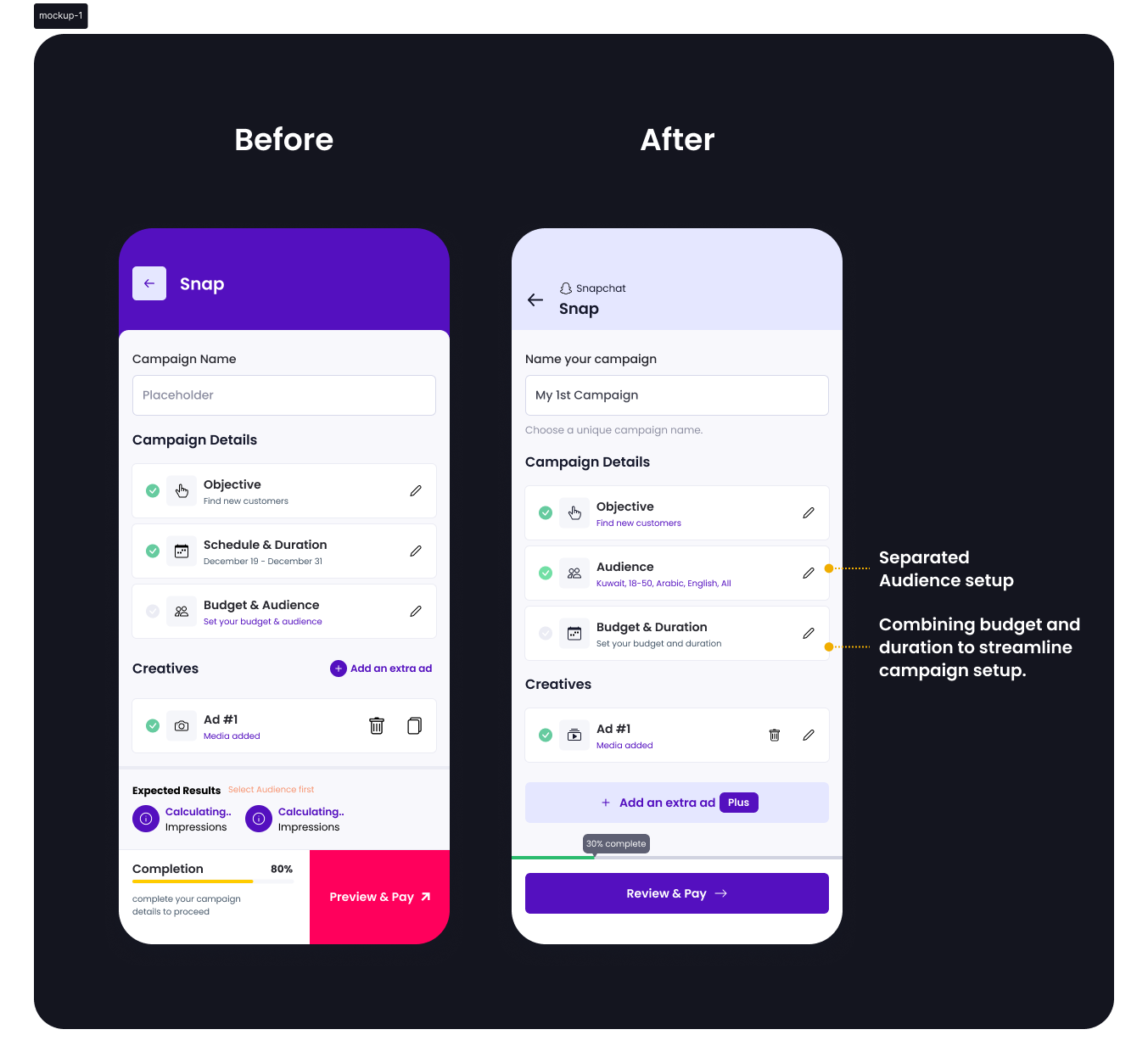
- Structural flaw identified: budget and audience were grouped, but duration was separated.
- Budget and duration are technically interdependent, yet visually disconnected.
Research
Understanding the pain points users face when setting up budget and duration for ad campaigns.
We collborate with support team and looked for the multiple sources to find out the problems.

Sources:
- 10+ support tickets over 2 months
- 5 user interviews (remote)
- Smartlook session recordings (20+ sessions)
Categorized themes objectives:
- Budget confusion
- Duration misunderstanding
- Audience targeting uncertainty
Next, we drafted a research questionnaire and sent it via email to active users who had set up campaigns recently.
Sample Questions:
- How often do you run ad campaigns?
- When setting a budget, how do you decide how much to spend?
- Have you ever seen a poor result and wondered why?
- Would a visual suggestion help your decision-making?
User journey
Research helped us understand their step-by-step journey, including where they dropped off or felt uncertain.
From this, we identified the gaps and moments where guidance was lacking.
Our process included:
- Mapping each stage of the campaign setup
- Identifying moments of confusion or friction
- Proposing new UX patterns to fill these gaps
Key insights
Research helped us uncover key challenges users face with budget, duration, and audience setup.
Users didn’t connect budget and duration until after poor results
Most users relied on guesswork for daily budget setting
Layout didn’t guide users to success; lack of inline education
Visual guidance was either missing or ineffective
Finding a Solution
Synthesizing insights from research, support, and interviews to define the right problems and frame impactful solutions.
Users need contextual, real-time feedback when entering budget.
Users need clarity on how duration and scheduling impact performance.
Users want reassurance and education, not just inputs.
Inline explanations and visual cues build confidence during setup.
Design strategy
Turning Insights into Actionable Design Enhancements
Research insights directly shaped the strategy by focusing on clarity, contextual guidance, and user empowerment.
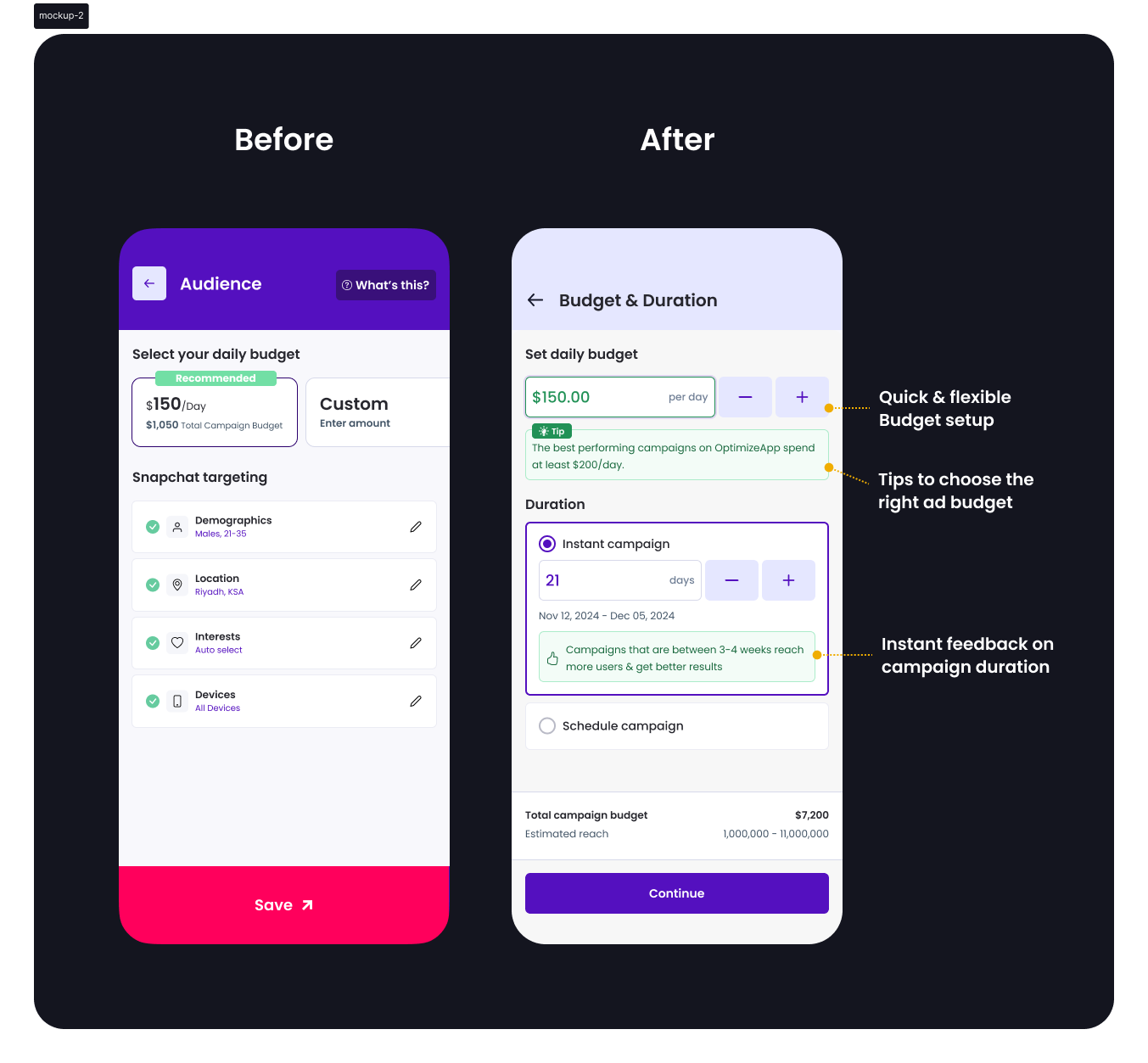
Tips to choose the right ad budget
Helped users avoid under/overspending by offering contextual guidance
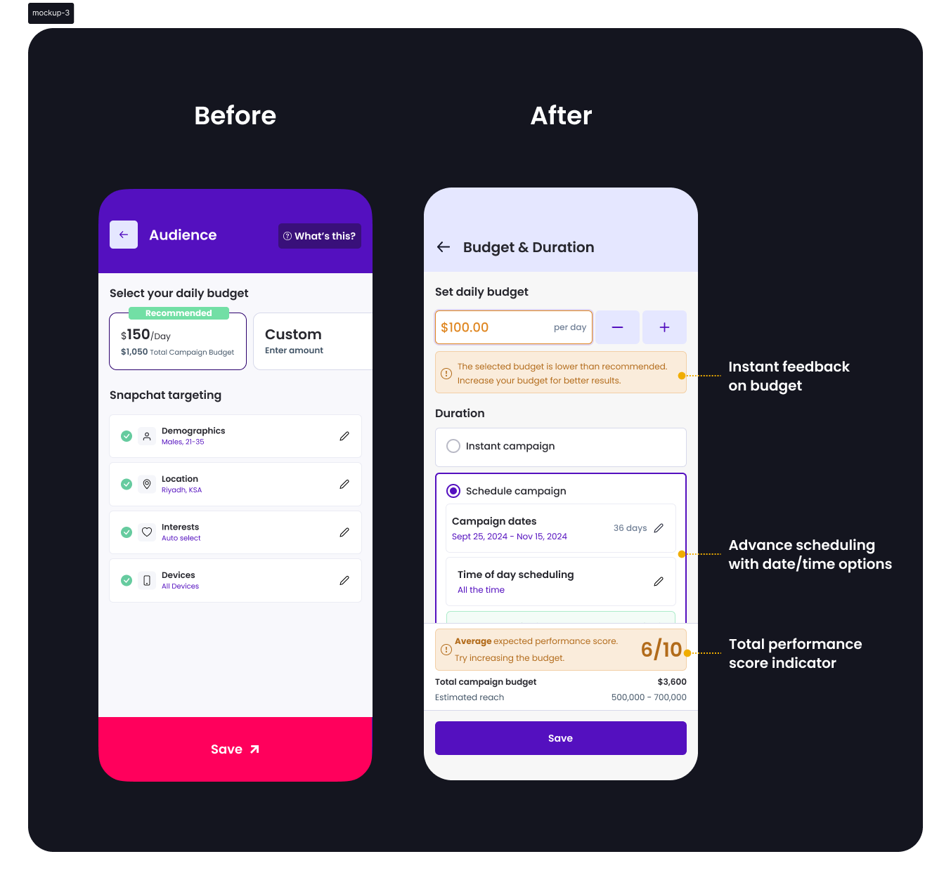
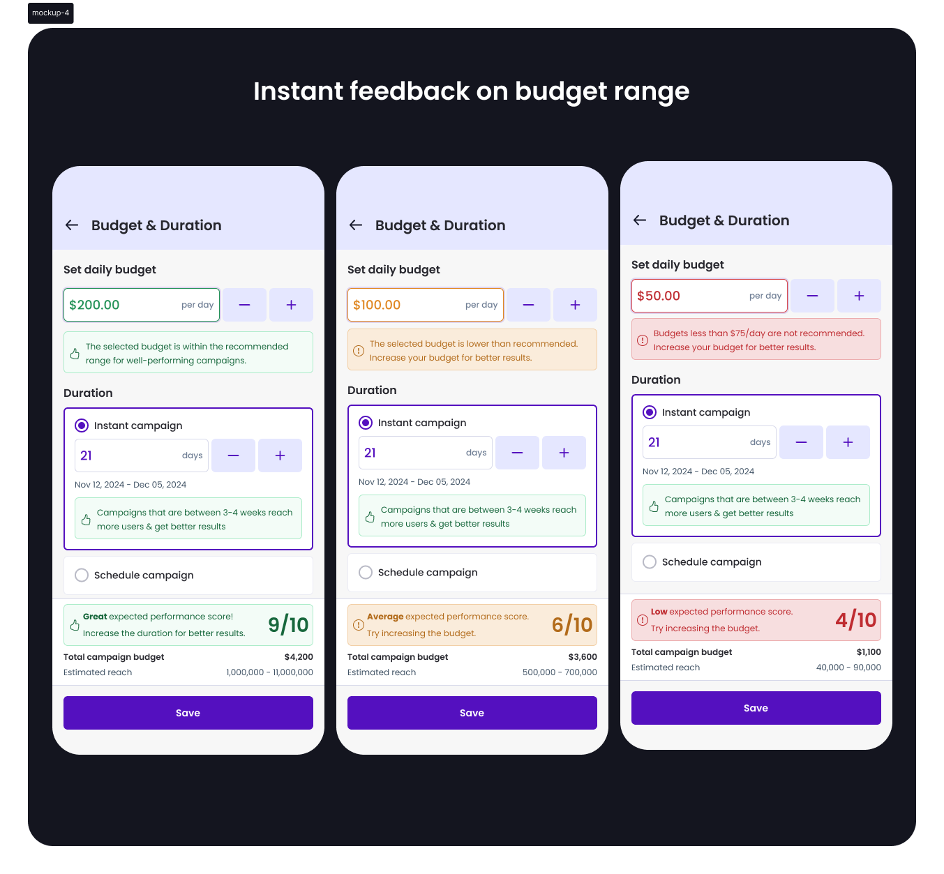
Instant feedback on budget range
Addressed the guesswork by validating selections in real time
Instant feedback on campaign duration
Reduced confusion around campaign length by showing clear outcomes
Smart scheduling with date/time options
Provided flexibility and encouraged planning precision
Total performance score indicator
Reinforced confidence by summarizing campaign readiness visually
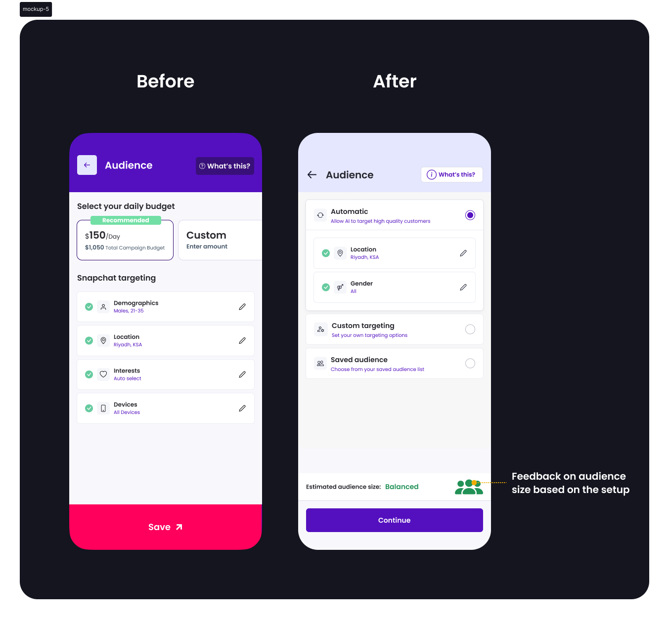
Separated audience with optimal options
Minimized decision fatigue with well-defined, upfront choices
Visual design
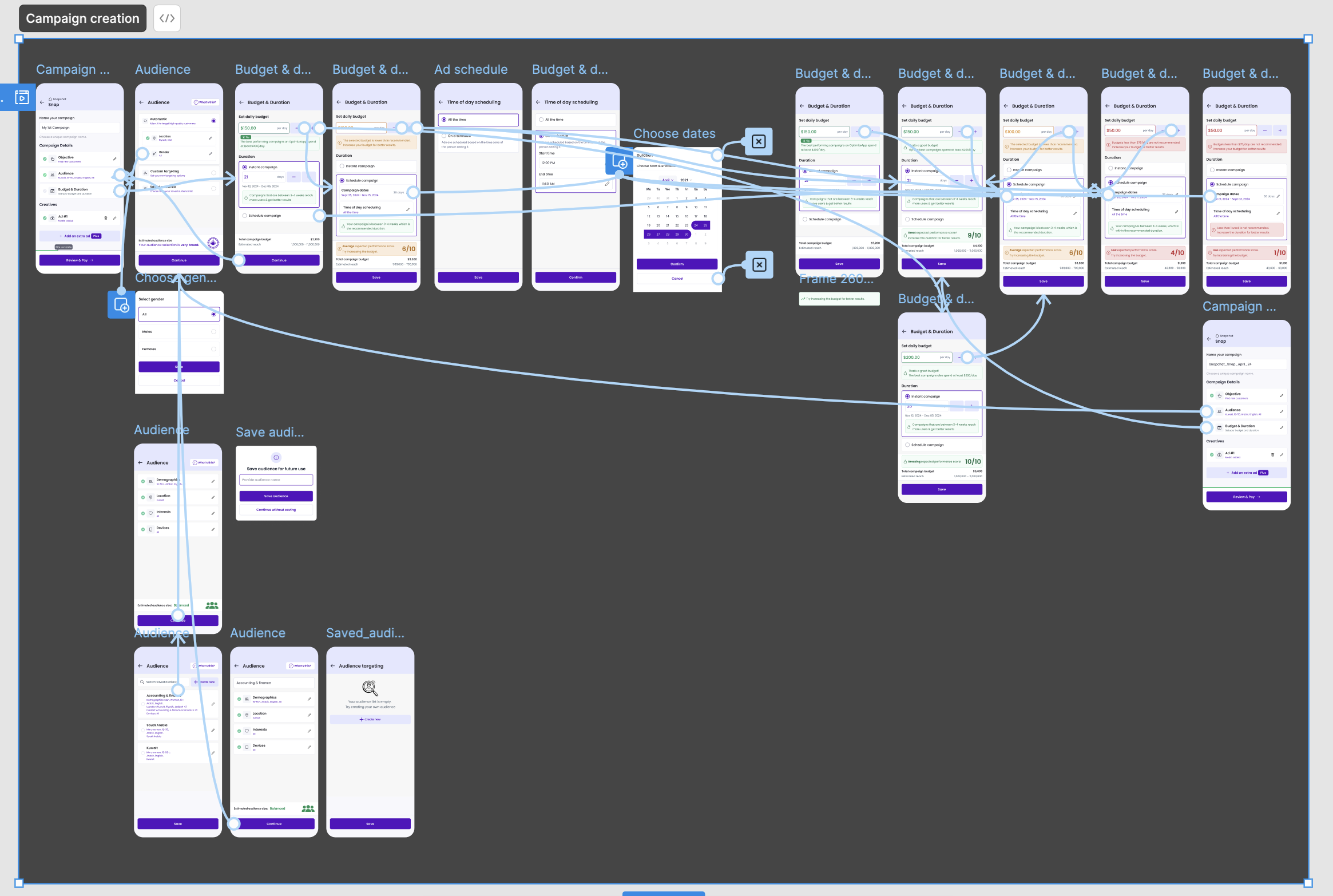
Mockups
Prototype
Testing
Usability Testing:
- 7 users tested the prototype
- 6/7 said they now understood how budget affects campaign performance
- All appreciated new visual indicators and simplified setup
A/B Testing Results:
- 60% users chose the recommended budget range
- 30% fewer campaign setup queries to support
Impact
Here are a few outcomes from the redesign:
Lift in correct budget selection on first attempt
Drop in related support queries
Improved setup completion rate
Final thoughts
This redesign brought clarity to campaign setup by aligning visual structure with user mental models.
Strategic research, combined with support insights and design thinking, led to a guided, confidence-building experience for users.